
Repose Gray paint will soon become your favorite color for your home. You might call it Repose Grey paint, either way you're gonna love it. It is one of the most popular Sherwin Williams colors.
If you're looking for a neutral color to paint your home, then Repose Gray SW 7015 by Sherwin Williams is the color for you. It is a gray with beige hints with a blueish-purple undertone. Repose Gray paint is a stunning color no matter where you paint it.
This post contains affiliate links, meaning I receive a commission if you purchase using the links below at no extra cost to you. All opinions are all my own.
REPOSE GRAY PAINT
We showed you some of the most popular Sherwin Williams paint colors in our post Popular Farmhouse Paint Colors. Other popular Sherwin Williams gray colors are Ellie Gray and Mindful Gray. But let's dig into the beautiful places where you can use Repose Gray.
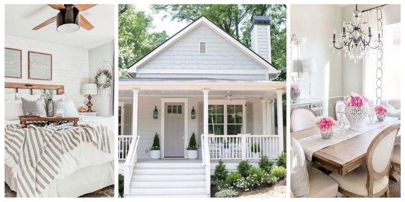
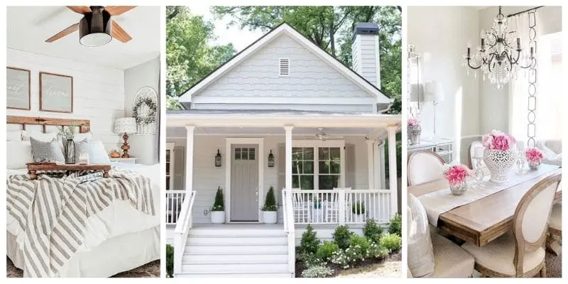
REPOSE GRAY PAINT ON THE EXTERIOR OF A HOUSE
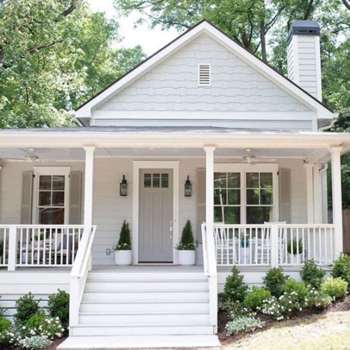
Leah, from Bell Sheep Studio, has a charming home. The siding of the house is Sherwin Williams Repose Gray. The doors and shutters are Dorian Gray by Sherwin Williams and the trim on the house is Alabaster White.
All of these colors pair together to make an inviting farmhouse.
Amazon Products
SHERWIN WILLIAMS REPOSE GRAY IN AN ENTRYWAY

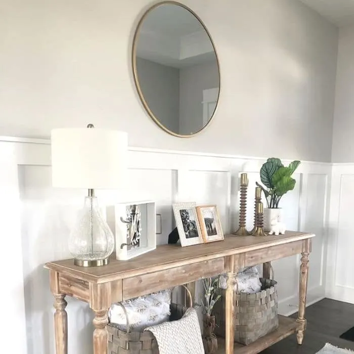
This entryway is a welcoming area with white wainscot and Repose Gray paint on the top portion of the wall. Brooke, over at Home Sweet Horton, has designed a lovely entrance for her guests. Choosing a paint color is the first step to pulling a room together.
If you love all things wainscot or shiplap, hop over to the Farmhouse Wainscot Ideas & Shiplap Too where you will find loads of ideas.

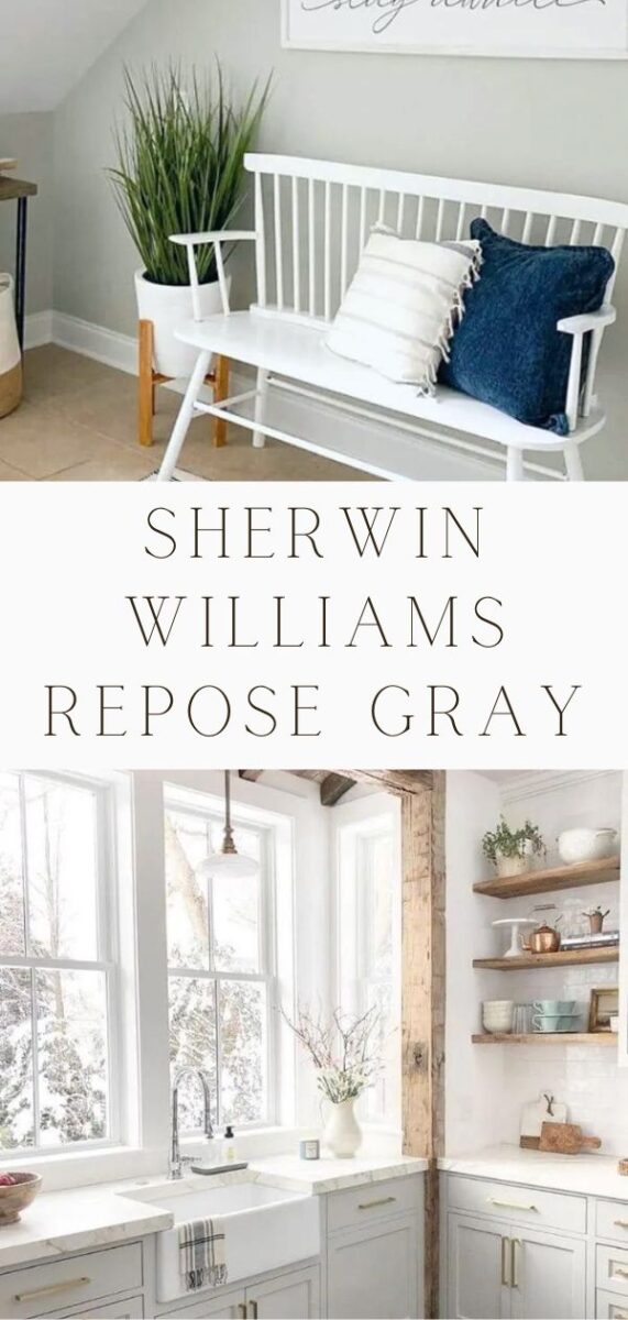
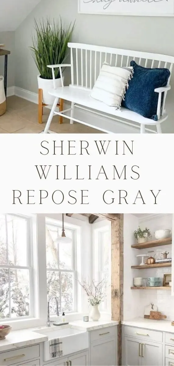
REPOSE GRAY IN A FOYER

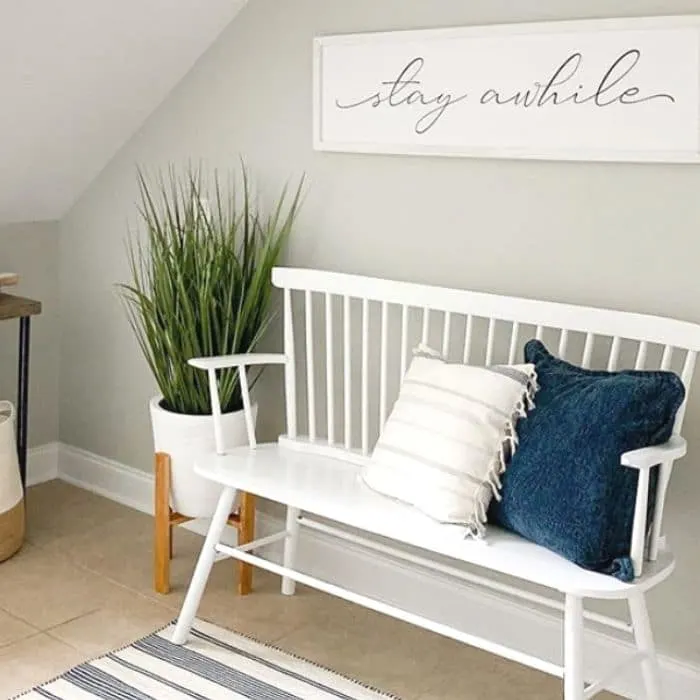
Cassie, at Coastal Cass, has a split foyer area and created a little nook that her kids could put on and take off their shoes.
With gorgeous Repose Gray, a bench, pillows and a inviting sign, who wouldn't want to “stay awhile?”
SHERWIN WILLIAMS REPOSE GRAY IN A MUDROOM
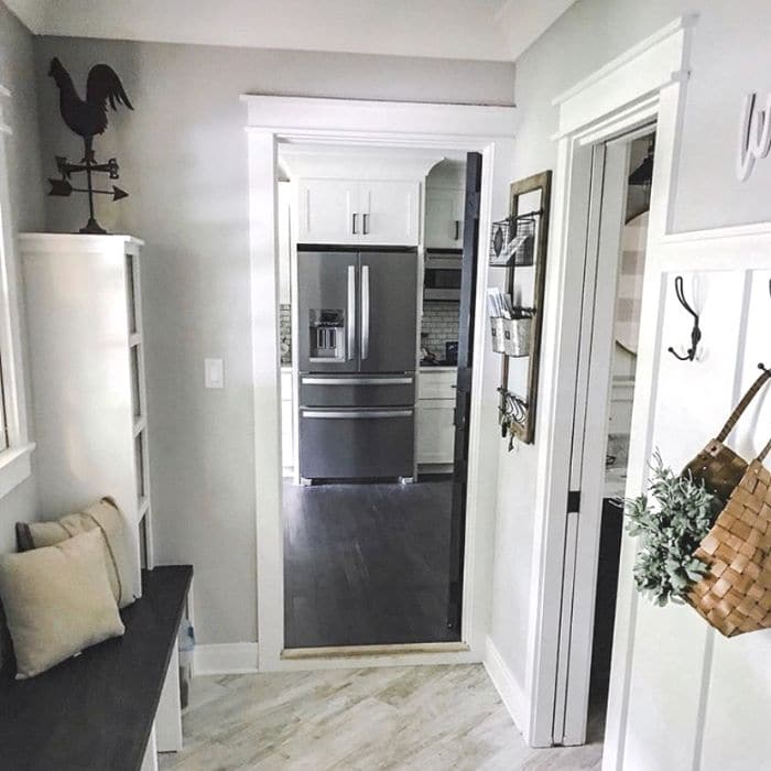
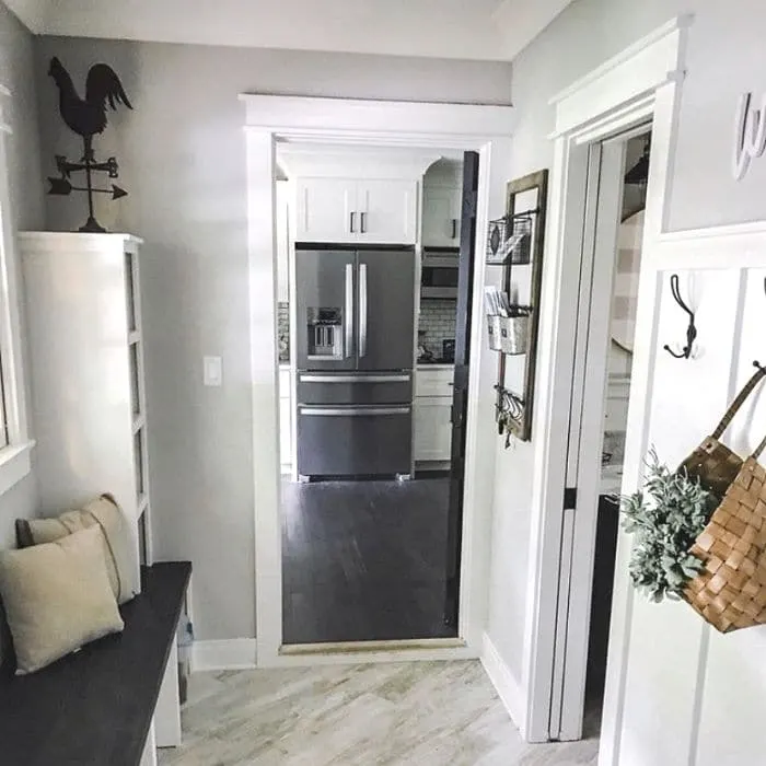
If you step into this mudroom, you're sure to feel your day brighten up. It's well organized and the paint and wainscot are easy on the eyes.
Michele & Anthony, from Living With Ants, have designed this room with the perfect farmhouse look.
Amazon Products
REPOSE GRAY PAINT ON KITCHEN CABINETS
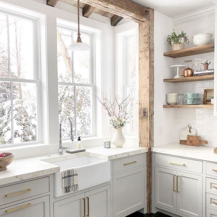
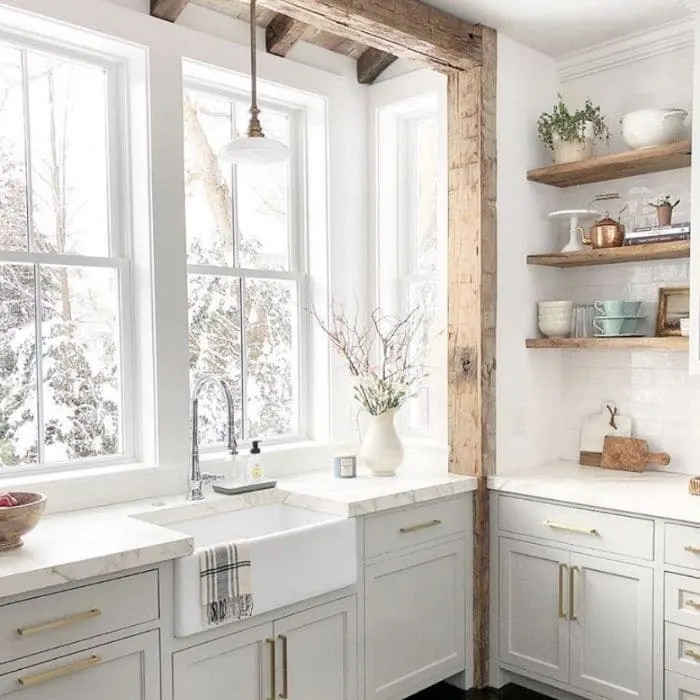
Jackie, over at Finding Lovely, has a breathtaking farmhouse kitchen. Her cabinets are painted in Repose Gray and adorned with gold handles.
Lovely describes her whole kitchen. The marble countertops and rustic chunky wooden beams are everything that makes up a farmhouse.
SHERWIN WILLIAMS REPOSE GRAY IN A DINING ROOM
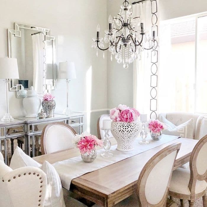
This dining room designed by Dana Interior Decor has an absolutely scrumptious dining area. Repose Gray accented by all the chicness in this room makes an appetizing place to have dinner.
One of the best things about this paint color is how it matches so many different looks. The possibilities for coordinating colors are endless. The pink flowers pop on this table.
REPOSE GRAY IN A BEDROOM

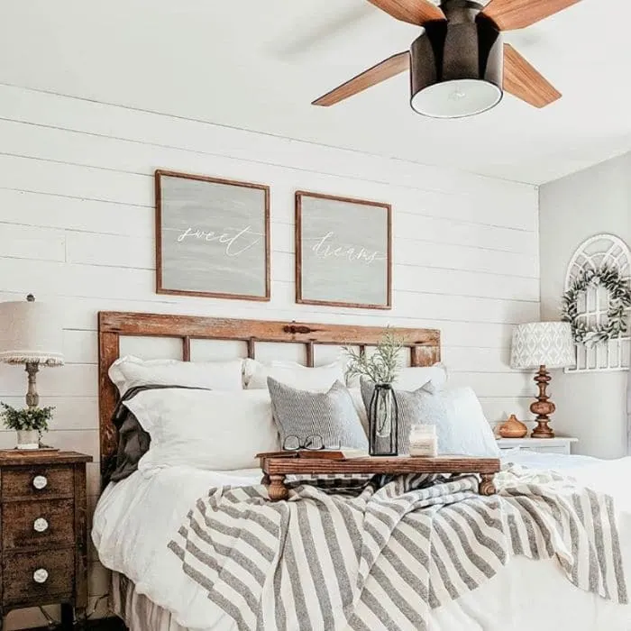
This bedroom looks like a total escape haven. The shiplap is stunning and the Repose Gray the perfect accent.
There's no doubt that Erica, from Our Forever Farmhouse, designed a room that will lull you into sweet dreams.
Amazon Products
CONCLUSION
Have you fallen in love with Repose Gray paint by Sherwin Williams? There are so many places you could paint with it. We showed you exteriors and interiors, but you could always paint furniture with it as well.
A farmhouse would be complete with this color incooperated in it somewhere. We'd love to hear if you already have this color in your home and where it is. Or if you're excited to paint with this color, we'd love to know where you're project will be. Let us know in the comments!
Happy Decorating!


Carla
Sunday 16th of July 2023
Hi Linda,
I have a tiny pantry off the kitchen (a small 10x10 room with a tiny 24in. x 24in. window) and a small ceiling light. It's obviously a tiny, dark room.
Would it be okay if I painted this room in Repose Gray? I know you're not supposed to use a dark color in a room with little to no light, but I just love the color.
Do you have any thoughts on this?
Thanks so much!
Carla
Linda McDonald
Monday 17th of July 2023
If you love Repose Gray then I would give it a try. Make sure you have plenty of light, watts, to compensate for the this color which has a lower LRV (light reflectance value). I hope this help! Good luck on your pantry remodel!
POPULAR SHERWIN WILLIAMS CABINET PAINT COLORS
Thursday 20th of May 2021
[…] shared Jackie's, from Finding Lovely, breathtaking kitchen before in our Sherwin Williams Repose Gray […]
Ramya
Thursday 25th of March 2021
Hi, Thank you for this post. Love this color. I’m thinking of the repose gray for my kitchen cabinets with a navy blue for the island. Am I over doing or would I’ll that have to be a teal/green for the island? What SW color would you suggest for the kitchen island? I looked at naval/In the navy and dark knight but can’t really decide.
yoli carr
Sunday 29th of January 2023
@Linda McDonald, Hi I am in love with this color as well. I just painted my living room and dining room with it. I may use it in the kitchen 50 percent lighter. However I would like to update our kitchen cabinets as well but I don't know what color to use. Can you please suggest a color that would go with Repose Grey for the cabinets.
Linda McDonald
Thursday 25th of March 2021
This is a very good question. If you like contrast then I think you will love naval on your island. Also, look at Hale Navy by Benjamin Moore. It is a beautiful color on cabinets.
Brandy Stuart
Thursday 3rd of December 2020
Hi there! I have Repose Gray on my kitchen cabinets but thinking about it for the exterior. For trim on exterior should I use Extra White or is that too bright? I have it inside but not sure if I should tone it down for exterior? Also, I would love to do a dark green front door. Recommendations? How about garages? Could I go dark there maybe with an Iron Ore? Or is that too much? Thank you!
Linda McDonald
Thursday 3rd of December 2020
Hi Brandy! These are all good questions. Repose gray is a great color for the exterior and I get what you are saying about Extra White being too white. I would consider Alabaster as a trim option if I was concerned about Extra White. I cannot think of a dark green color for your front door off the top of my head but Iron Ore is a great color. Peppercorn is also very pretty. Have you looked at my Popular Exterior Paint Colors post? It is a good resource and might help you think through your colors more. Good luck with your painting project. What you are considering sounds great!
Elizabeth
Friday 9th of October 2020
Beautiful pictures! I'm sold on Repose. What trim did you use? Would Alabaster work?
Mariacorina Perez
Monday 26th of June 2023
@Linda McDonald, hola! I just painted my whole house repose with extra white trim and shutters real teal from SW. it looks nice but still getting use to it 😂 have you try these colors together ?
Linda McDonald
Sunday 11th of October 2020
Alabaster is a great color with Repose. Extra White is also a great color for trim. I recommend painting your trim throughout the house the same color so if your house already has a white trim color I would go with that color.