Have you ever walked into a hotel bathroom and thought, I wish mine looked like this? That’s exactly how I felt during my stay at the Ritz-Carlton Orlando. The space was filled with smart details—clever lighting, oversized mirrors, sleek glass doors—that made even a small bathroom feel like a spa retreat.
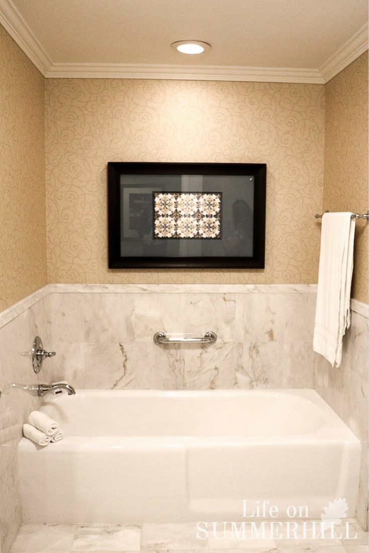
The best part? You don’t need a luxury hotel budget to recreate the look at home. With a few simple bathroom design tips and tricks, you can add light, style, and function to any space. From bathroom lighting ideas to storage solutions that actually work, these designer-approved details will take your bathroom from ordinary to extraordinary.
Bathroom Design Tips to Create a Luxury Look at Home
Bathroom Lighting
Let's start with lighting because I feel that it is often overlooked, yet possibly the most essential part of a bathroom design.
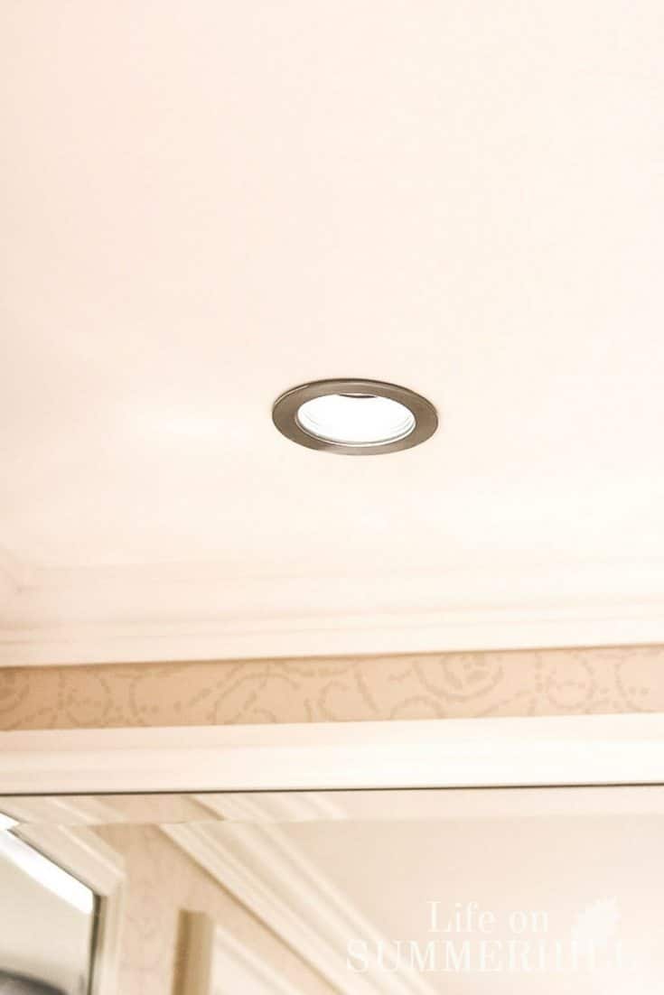
Lighting should be one of your first considerations when designing your bathroom. When selecting lighting for your bathroom, I bet you go straight for the wall-mount light fixtures. However, let me encourage you to consider recessed lighting.
No matter your bathroom layout, it can be the perfect way to brighten the space. This is especially beneficial if the room lacks natural light and relies solely on artificial lighting.
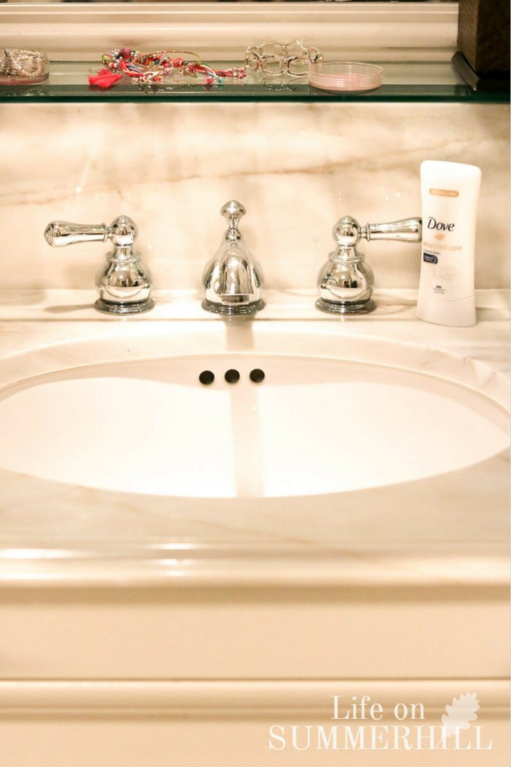
In this bathroom design, the only lighting used was the recessed lights centered over the sink, about 12 inches away from the wall. Notice in the first picture of the sink, the light is cast onto the sink and the faucet, making the white glossy porcelain sink sparkle.
Another reason for only coming out 12″ from the wall is that it throws the ray of light in front of you when you're looking in the mirror instead of on top of your head. This is especially important in the vanity areas of the bathroom. It will illuminate your face better for applying makeup and such. Great design and easy to accomplish!
Plus, you don't have a light fixture to keep clean! A small recessed light is also an excellent idea for a powder room. A bonus is that cleaning your mirror is now super easy because there is nothing in the way, which brings us to the mirror.
Vanity Mirror
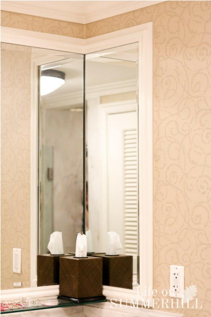
There are lots of mirror options out there. If you have a smaller bathroom, I encourage you to think big. In the Ritz-Carlton bathroom, mirrors were positioned in front of you and on the sides, all extending almost to the ceiling.
This is brilliant and another trick I learned in college. Bringing the mirror to the sides allows light to bounce around, creating the illusion of a larger space. Also, extending almost to the ceiling or to the ceiling doubles the room size. Believe it or not, in my home, my master bathroom is smaller than my daughter's, but because I extended the mirror from the counter-top to the ceiling, it appears to be larger.
Check out my full mirror in my post on French country bathroom renovation.
You can also hide a medicine cabinet in a side mirror to give you extra bathroom storage. We did this in my sister's city house here.
Oh, maybe you're wondering how they did the trim work around the mirror. It's a thin piece of wood about 3″ wide by 1/4 thick with 2 1/2″ casing laying on top and all caulked and painted white. High-end looks without the high-end price.
Bathroom Shelves
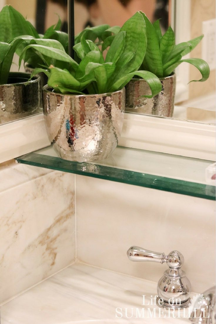
If you haven't already noticed, take a look at the extra-high backsplash. This is a very functional element to the design that serves a purpose.
If you have a family that splashes a lot when washing in the sink, then consider a higher backsplash. It will help prevent the mirror from discoloring due to water.
This element was perfect for the Ritz and its busy bathroom. However, this backsplash serves a dual purpose. It also holds the thick glass shelf, which adds more counter space to the bathroom, giving you easy access to the items you need.
Many small bathrooms lack sufficient storage space. So, if you're struggling with space in your bathroom, consider this tip when redecorating or doing a full bathroom remodel.
Bathroom Shower
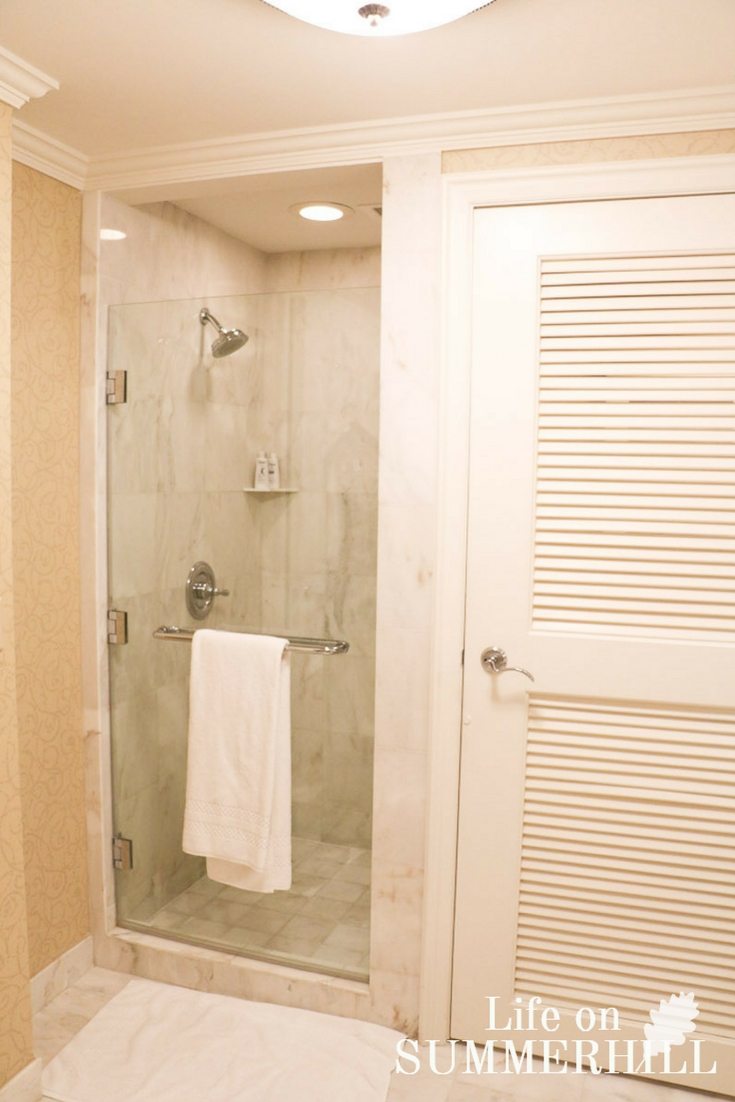
Shower Glass Door
Now for the shower area. While it's usually the smallest space in the bathroom, it deserves special consideration. Whether you have a large shower or a small one, there are many tips and tricks in this shower, and most people enjoy these features without even noticing them.
Let's start with the glass door. If there is one area to splurge, then this is it. Go with a heavy glass door for your walk-in shower. Notice that there is no trim around this glass. The clean appearance makes the small shower space seem larger and cleaner. And again, the best part is how easy it is to care for. Glass shower doors are ideal in small bathrooms.
Shower Door Handle
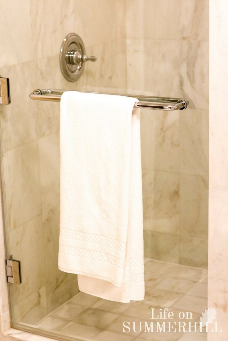
Another feature of this door is the handle. Usually, you find a large vertical handle on these doors. But why not go larger and horizontal? Then you have a place to hang your towel while you are showering.
It now doubles as a towel rail. No more sitting your towel on the floor or hanging it over the shower door where it gets wet!
Shower Shelf
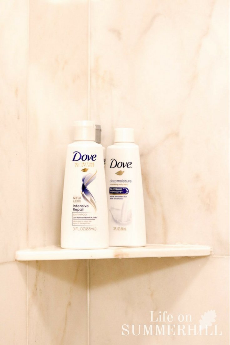
For several reasons, it is essential to have shelving inside a shower. In this case, they used the same marble tiles as their shelves. This is possible because they can polish the cut edge.
I would only recommend this for natural tiles like marble, granite, travertine, and such. A professional tile layer will know how to do this. So if this is what you want to do, consult with them before you hire them.
It is also good to have one shelf high for shampoos and soap, like these Dove products, and one lower for more bath products. The low one is also useful for propping your foot up while shaving your legs, so make sure it is about 24 inches from the floor. This is so helpful if you have a separate shower, so you don't have a bathtub edge.
One final thought is to add one more shelf. We found that two was not enough. I would recommend adding one more if you have enough space, especially if this is a family bathroom. It doesn't take up much space and will be so helpful.
Bathroom Tub

Tub Lighting
Now let's talk about lighting again. If you are lucky enough to have a separate tub and shower, then consider what kind of lighting you want over your tub. Here is a great place to jazz up your design and do a semi-flush or drop-down light.
If you are a fancy kind of person, a mini chandelier would be super cute over your separate bath. But if you're a less-is-more person or don't want another thing to clean, then go with recessed lighting like they did here.
However, instead of centering the recessed light over the tub from all directions, have it come out 12″ from the wall. The light will wash the wall higher up, and you won't have a spotlight on your head when you are having a spa moment.
Tub Grab Bar
So, if you need a grab bar in your tub, why not go for a shorter one? Grab bars don't need to be unsightly to be useful. If you need a grab bar to get into and out of your bathroom, you may not need a super long one. Sometimes, a long bar may be necessary or it could be a code requirement, but if you need a little extra help, then go for a shorter and prettier one.
Wall Tile
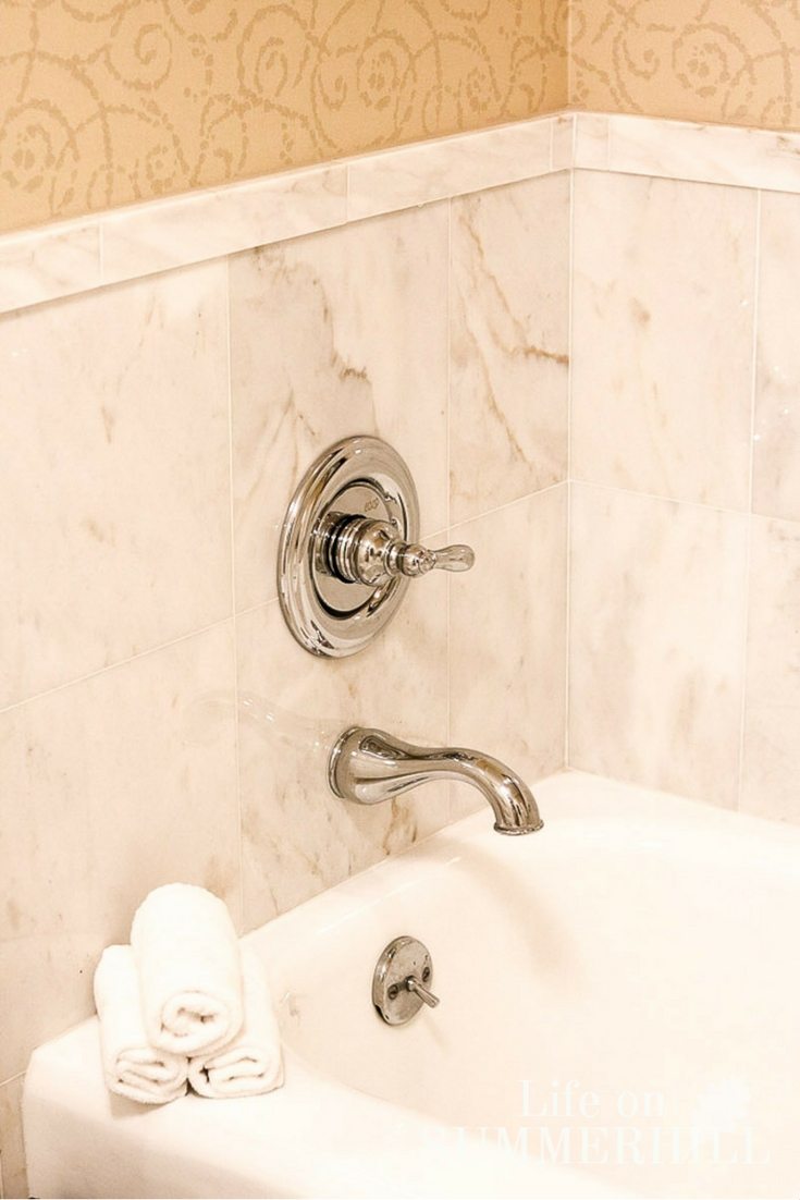
I haven't quite figured out why builders don't put tile around a tub. Many times I see bathroom paint scarred from water splashing on the sheetrock wall. Tile is an important consideration for a bath design.
Another problem with this is that when water gets on the sheetrock, it creates an excellent environment for mold and mildew to form. Ceramic tile is a beautiful and practical design choice. So check out the Ritz tile design around this tub. There is nothing fancy about it, but it is functional and clean.
Another trick about the tile in this bathroom is that the wall and floor tile are the same size and color. This is another important consideration when selecting your bathroom floors. Not breaking things up will make a room feel neater and larger.
Also, consider a zero grout line. Now you're probably wondering, “What is a zero grout line?” Well, it is a super-thin grout line. This is another trick that helps keep grout mildew-free and makes cleaning up much easier.
If you want to do a zero or knife-edge grout line, look for tiles that are very straight and all the edges are a sharp 90 degrees. I have done zero grout line with tiles that have a textured edge, and it looks okay, but the straighter the edge, the better.
Bathroom Design Basics FAQs:
What Elements are Most Important in Bathroom Design Basics?
Many times when remodeling or creating a new bathroom, we miss out on many, and I mean many, details that can take it from great to outstanding. Lighting, mirrors, and other items can create a much more functional bathroom as well as one that is aesthetically pleasing. When you're designing a small bathroom, this is even more important.
What Bathroom Design Basics Items do you recommend?
I always recommend consulting a professional before you do any installation that may require electrical, plumbing, or structural expertise.
- Wet-rated set of LED recessed lights kit
- Frameless large bathroom mirror
- Wood trim for mirror
- Glass shelf
- Frameless shower door
- Brushed nickel bath grab rail
Final Thoughts
Great interior designs are made up of many details. As you can see, good bathroom design makes all the difference, even if you're working with a small space. No matter your bathroom style, it's the details that will take your bathroom from good to great.
Your family members will be so impressed and appreciative of the space and design. And you don't have to break the bank to pull off the designer look. I hope each detail we talked about is helpful, and please feel free to ask me any questions. Thanks for joining!!
Looking for more bathroom design tips? Check out these posts:
- Small White Farmhouse Bathroom Remodel
- Small Bathroom Ideas for your Farmhouse
- Small Farmhouse Bathroom Ideas with a Minimalist Touch
Now it is your turn. Do you have any bathroom design tips and tricks you can share?
Happy Decorating!

These are great tips and I love that tub. I just want to soak on it with a cool washcloth over my eyes and a glass of wine in my hand…. Ahhhhhhh
Love the “less is more” design of this bath.
If I’m ever able to remodel my bathrooms, I will try some of these ideas. Zero grout lines and higher than normal back splash are ideas that really make a lot of sense. Great post!
Glad you got some ideas from the Ritz!
That bathroom is gorgeous!
I agree! It was hard to leave.