Every year, I look forward to seeing what paint brands choose as their Color of the Year. Not because I love trends but because these paint colors quietly tell us how people want to live.
The Paint Colors of the Year for 2026 are speaking softly. They feel calm, grounded, and deeply comforting.
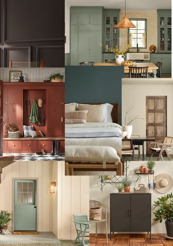
These are colors for cozy cottages, collected homes, and slower living. As someone who spent over 30 years as a designer selecting hundreds of paint colors, I can tell you this shift feels meaningful.
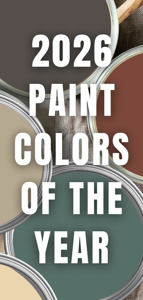
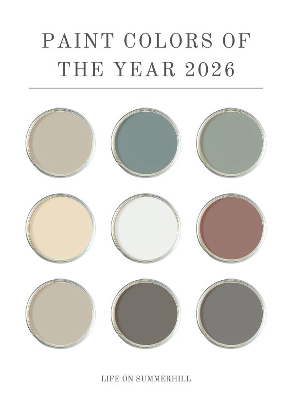
Paint Color of the Year 2026
Let’s walk through each brand’s selection and discuss where these colors truly shine.
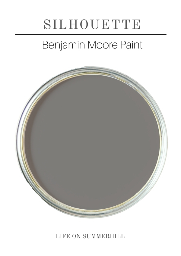
Benjamin Moore Silhouette (AF-655)
Benjamin Moore Silhouette is a rich, dramatic espresso brown with charcoal undertones. It even carries the faintest hint of purple, which gives it depth and elegance.
Where I recommend using Silhouette:
- Accent walls
- Movie rooms or libraries
- Furniture pieces
- Built-ins or bookcases
- A front door or shutters (if you want something unique)
Finish tip: I recommend eggshell or satin. Flat can feel too dull, and gloss only works if you’re going for a very high-end, formal look.
Silhouette pairs beautifully with warm woods, brass, and layered textiles. It feels timeless, not trendy.
Fun fact: Did you know your local Ace Hardware carries Benjamin Moore paint?
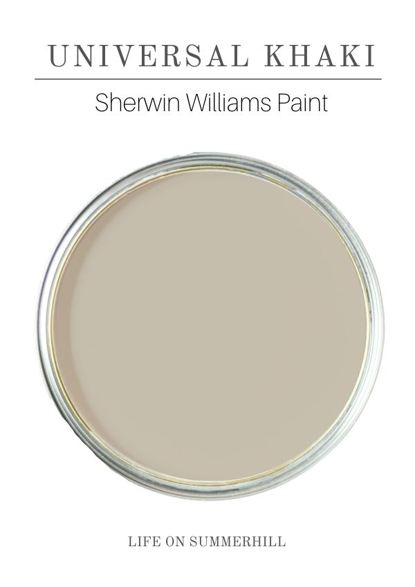
Sherwin Williams Universal Khaki (SW 6150)
Sherwin Williams Universal Khaki is a warm, mid-tone neutral with a red-leaning undertone. It has an LRV of 40, so it’s grounded without being heavy. This is one of the most livable colors on the list.
Where I recommend using Universal Khaki:
- Whole-house wall color
- Common areas
- Trim (yes, it can work beautifully)
- Color drenching (walls, trim, doors, all the same color)
- Furniture
- Cabinets (not my first choice, but absolutely possible)
Exterior thoughts: Front door or shutters are possible depending on your exterior materials and roof color. This might be a fabulous color paired with brick.
This color works with black accents, creamy whites, and deeper earth tones. It feels classic and calm.
Did you know: Lowe's carries Sherwin Williams paint?
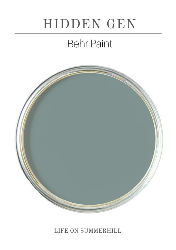
Behr Hidden Gem (N430-6A)
Behr Hidden Gem is a dramatic blue-green with depth and richness. It feels bold but intentional. It is giving me coastal dramatic vibes.
Where I recommend using Hidden Gem:
- Accent walls
- Dining rooms
- Powder rooms
- Furniture
- Moody spaces with good lighting
Exterior thoughts: This is a possibility for front doors or shutters. This color shines indoors, where you want drama and personality, and outdoors as accents.
Did you know: You can order your Behr paint on the Home Depot app for curbside or in-store pickup. This is a fantastic timesaver.
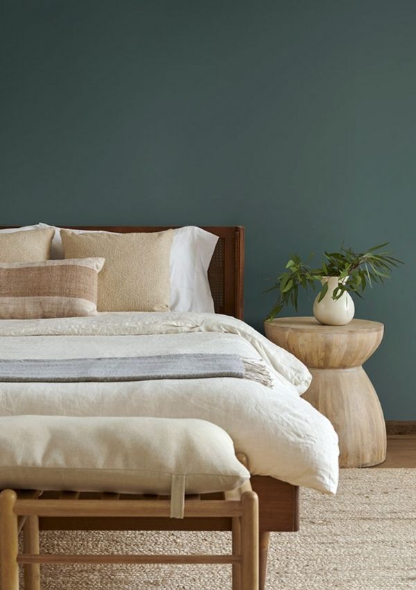
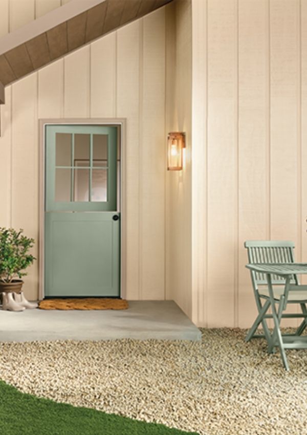
Valspar Warm Eucalyptus
Valspar Warm Eucalyptus is a muted gray-green inspired by nature and wellness. It’s soft, calming, and incredibly versatile—perfect for cozy cottage and vintage homes.
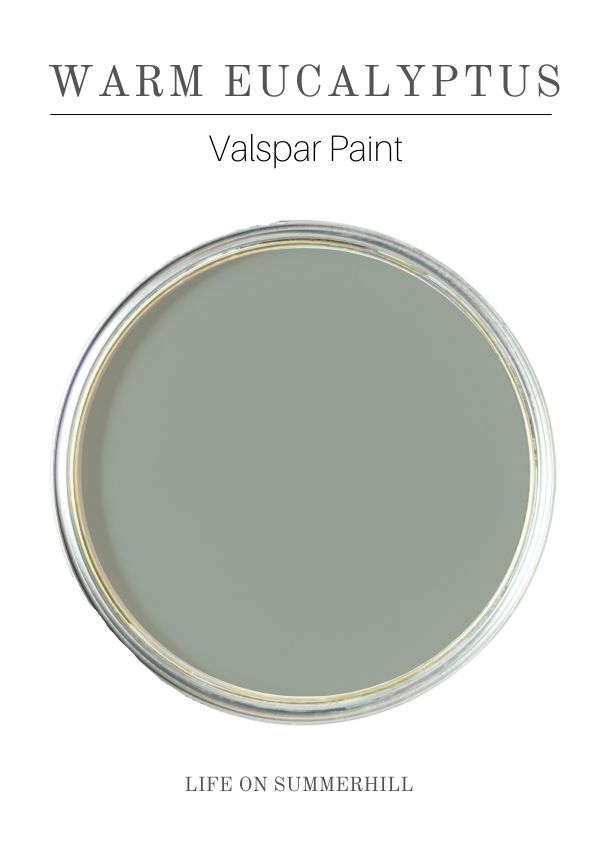
Where I recommend using Warm Eucalyptus:
- Bedrooms
- Living rooms
- Kitchens
- Cabinets
- Furniture
- Accent walls
Exterior thoughts: A beautiful front door color. Shutters could also work, depending on the home's style. This color evokes a sense of peace and supports slow living.
Dutch Boy Melodious Ivory
Dutch Boy Melodious Ivory is a warm, creamy off-white that reads like a muted soft yellow. It’s soft, not stark or modern.
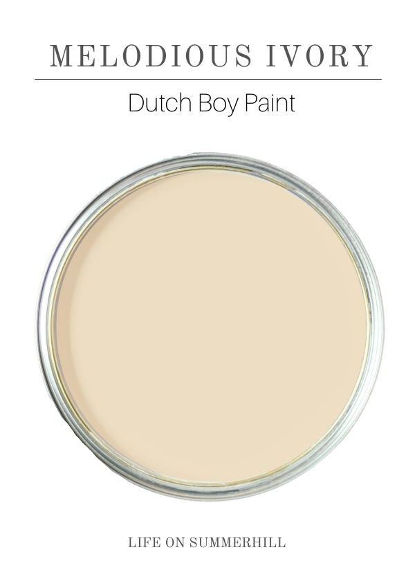
Where I recommend using Melodious Ivory:
- Walls
- Trim
- Ceilings
- Whole-house palettes
- Exterior
Exterior thoughts: If someone wanted a yellow exterior, this is the shade I would recommend. Yellow is a distinctive exterior color, and many homeowners prefer classic, neutral colors.
Krylon Matte Coffee Bean
Krylon’s Matte Coffee Bean is a deep-brown spray paint, ideal for DIY accents.
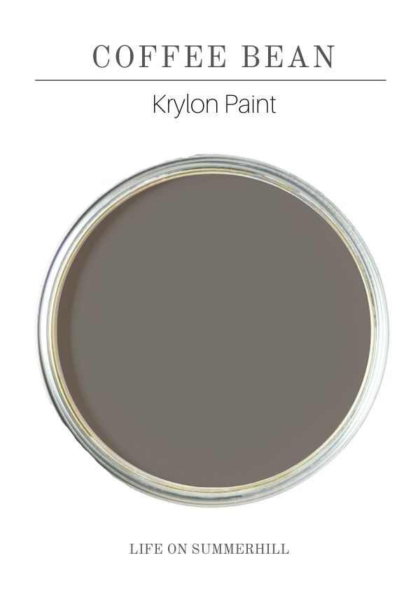
Where I recommend using Coffee Bean:
- Furniture
- Decor pieces
- Lamps, frames, and small accent items
Exterior thoughts: A beautiful door or shutter color if you want to spray paint it, but perfect for adding richness in small doses indoors.
Glidden Warm Mahogany
Glidden Warm Mahogany is a red-brown that feels classic and cozy, like traditional Americana.
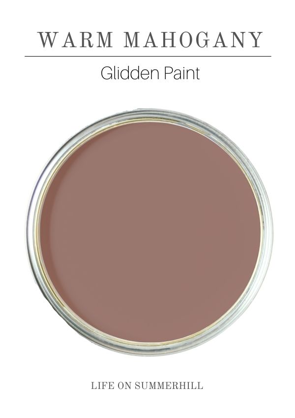
Where I recommend using Warm Mahogany:
- Front doors (a beautiful, warm barn color)
- Furniture and cabinetry
- Accent walls or dining rooms
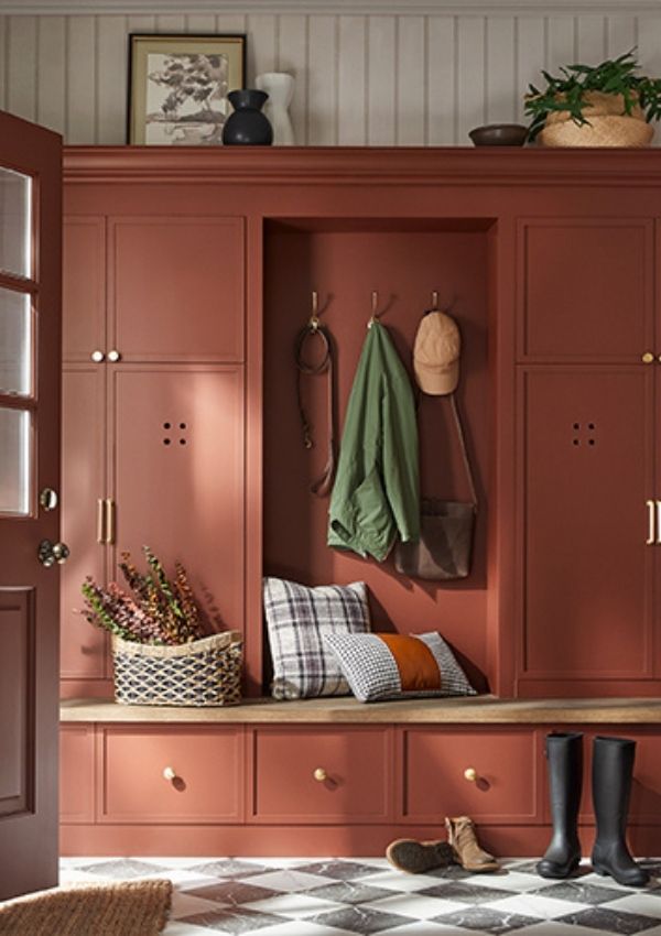
Exterior thoughts: This is a great front door color, especially on traditional or cottage-style homes. It has a timeless, welcoming feel.
Pantone’s Color of the Year
Pantone is the authority that sets the color of the year for just about everything—fashion, home decor, beauty, accessories, and so on. So when they chose Cloud Dancer, a soft, airy white, it really caught my attention.
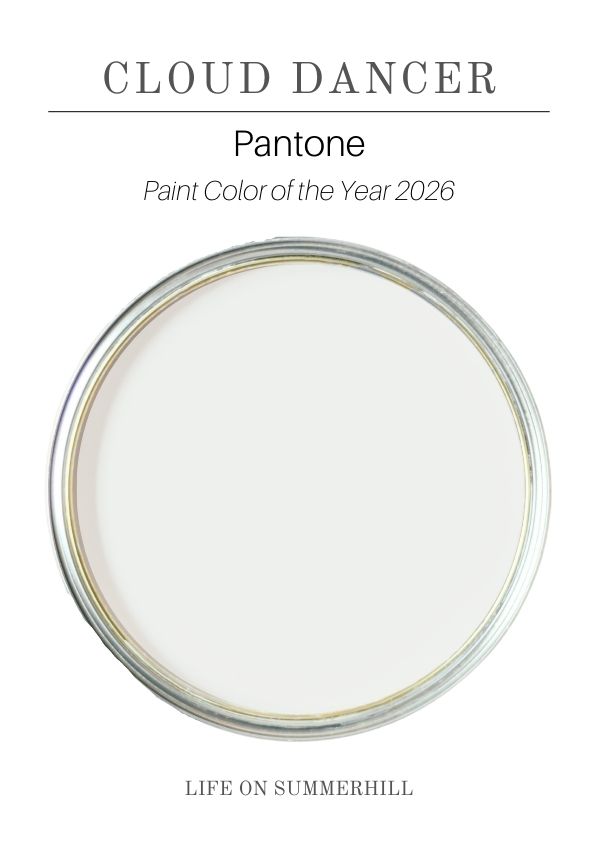
I have to say, I was pleasantly surprised. It’s a nod to the idea that whites are making a comeback. And personally, I believe white never really goes out of style. It’s the easiest color to work with, making every room feel brighter and lighter.
This year, the word on the street is slower living and finding peace. No wonder Pantone chose Cloud Dancer. White builds serenity and spaciousness. Think a spa like bathroom or a spacious kitchen.
While some people brush over this color, I think Pantone made a great choice here.
Designer Tips:
Colors You Love vs. Colors You Can Live With
There’s a big difference between colors you’re drawn to and colors you can comfortably live with every day. Before choosing a paint color, pause and ask yourself a few honest questions.
- Have I ever lived with a color this dark? I used to ask clients this when I designed homes, because if you’ve lived with a dark color before, you already know you can live with it again.
- Do darker rooms energize me, or do they feel heavy? Look at colors that give you peace and make you feel beautiful or happy.
- Does this space have high ceilings and lots of natural light? Tall ceilings and lots of natural light can handle dark colors better without making the room feel like a cave.
When LRV Matters
If you know color affects your mood, pay attention to LRV. For brighter, airier spaces, I recommend looking for colors with an LRV of 75 or higher. These shades reflect more light and help a room feel open.
To learn more about LRV, check out my Understanding LRV in Paint post.
Final Thoughts on the Paint Colors of the Year 2026
2026 colors of the year aren’t flashy. They don’t rush. They reflect a growing desire for cozy, peaceful, calm, and grounded spaces. This is slow living in color form.
If you’d like to see the Paint Colors of the Year from previous years, check out these posts:
What’s your favorite color from this year’s picks, and where would you use it? I’d love to hear your thoughts in the comments below. I hope you’ve enjoyed this blog post and found it helpful!
Happy Decorating!