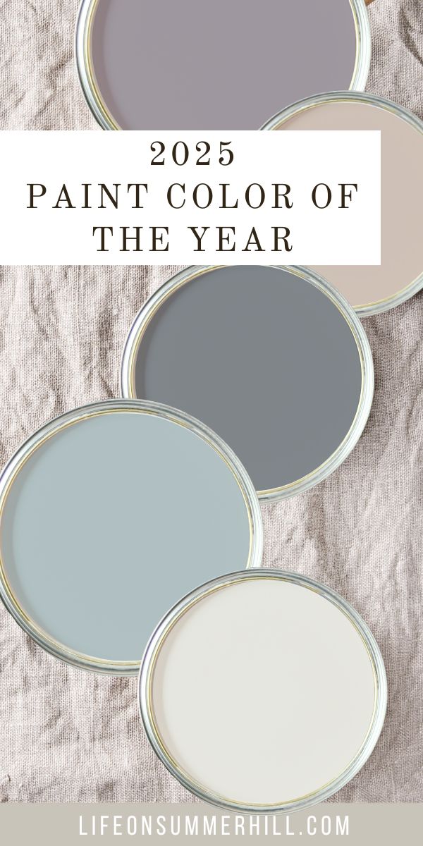
Are you searching for a trending paint color to refresh your home or curious about the future of home decorating paint trends? You're in the right place! Today, I’m excited to share the Paint Color of the Year for 2025.
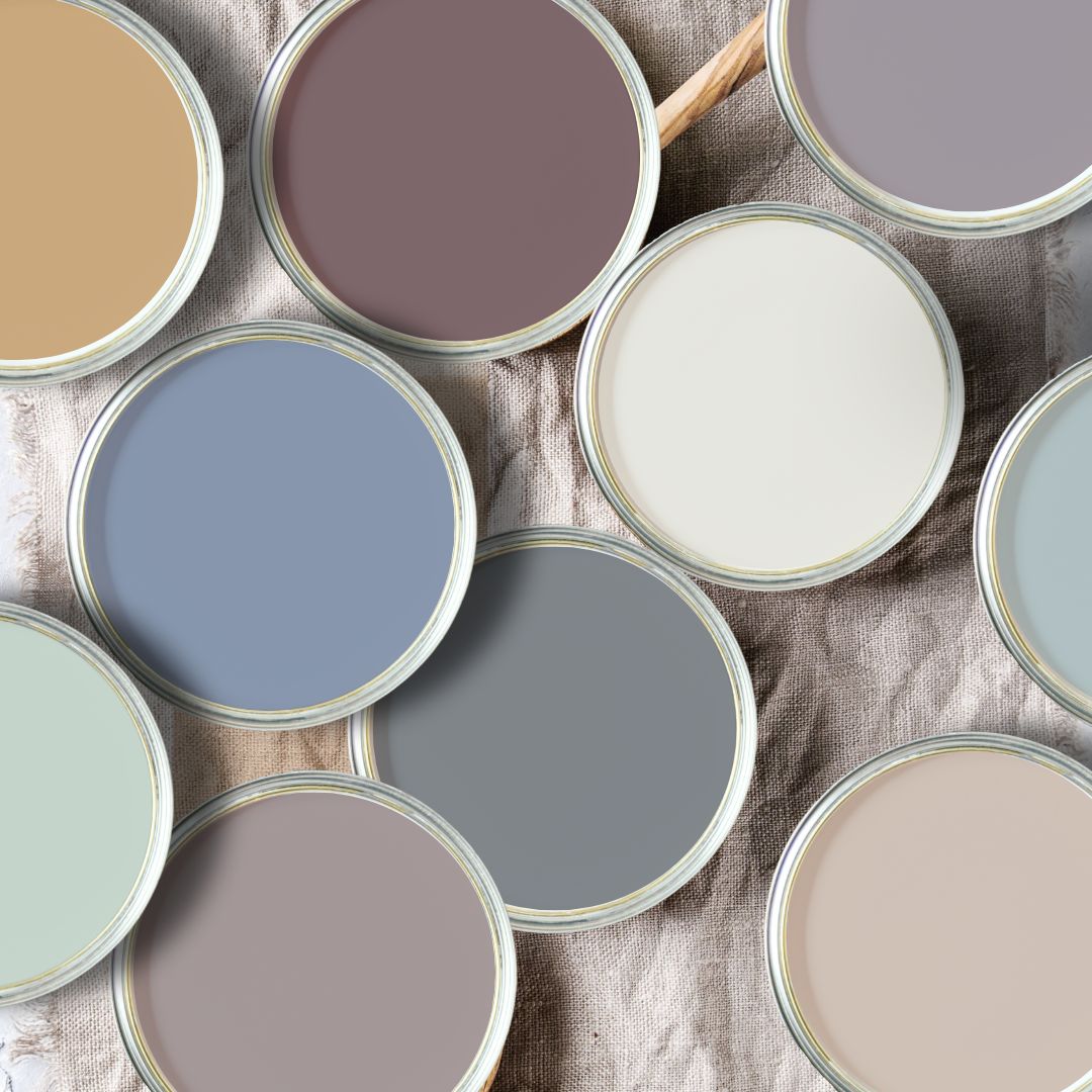
Paint Color of the Year 2025: A Deep Dive
As an interior designer, I keenly anticipate the annual paint color forecasts from top brands. It's a fascinating glimpse into the future of color, a hint of what is to come for our homes.
Some years, a unifying theme emerges across the board, while others, the selections seem to contradict each other.
This year, a distinct trend is evident: a yearning for depth and richness. While the past decade saw a surge in popularity for cool grays and crisp whites, 2025 seems poised to embrace a more moody and vibrant color palette. I'll be watching with growing interest as to how these amazing colors are used throughout the year.
2025 Color Predictions by Brand
To truly understand the direction of color trends, we must examine the selections of leading paint manufacturers.
In the United States, Benjamin Moore, Sherwin-Williams, and Behr consistently set the stage. Let's delve into their choices.
Sherwin-Williams Paint Color Palette
Sherwin-Williams bucked tradition this year, presenting not one, but nine colors as their Color of the Year palette.
This SW paint color collection of the year, is comprised of:
- Grounded (earthen brown)
- Sunbleached (light neutral poised between warm and cool)
- Chartreuse (vibrant yellow-green)
- White Snow (pure white)
- Rain Cloud (deep grey blue)
- Clove (nearly black brown)
- Malabar (sandy beige neutral)
- Mauve Finery (muted purple)
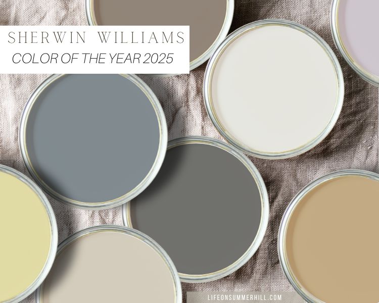
These subdued hues, ranging from a brownish black to a snowy white, evoke a sense of tranquility and calm. There is a little something for everyone here. Does Sherwin-Williams believe we're seeking serenity in our homes? Perhaps.
The Rain Cloud color is a personal favorite. Its dusty grey blue color is perfect for Cottagecore decorating as well as many other styles. Mauve finery is a fantastic purple for painting a room because it is low on the light reflectance scale and has a calming effect.
If you love seeing the future trends in decor, check out these paint colors of the year for 2026.
Stay tuned because you will see more purples in the colors of the year's selections from brands. Keep reading!
Benjamin Moore: Cinnamon Slate
Benjamin Moore, a favorite among designers and homeowners, has selected Cinnamon Slate as their Color of the Year. Do you see what I see—a hint of purple?
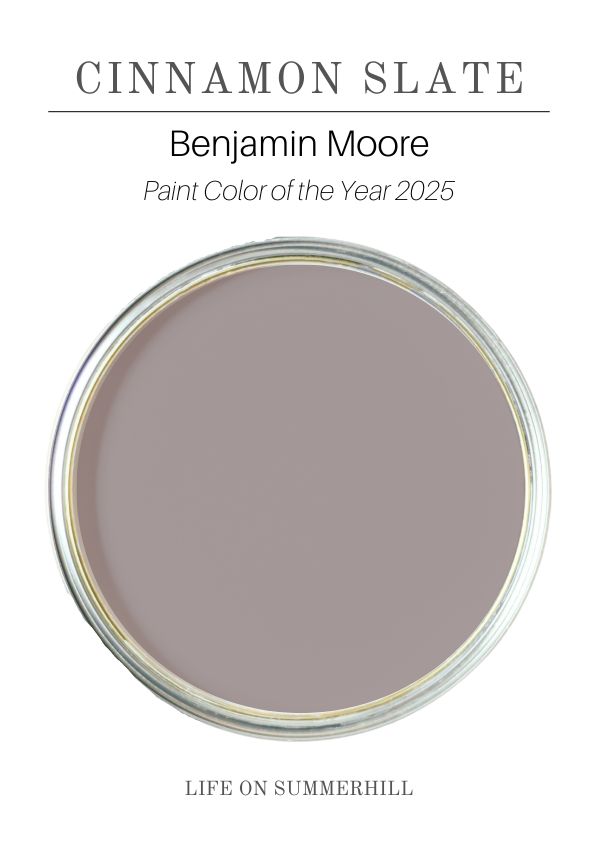
This intriguing shade, an inviting hue that blends velvety brown and plum, echoes the emergence of color drenching we've witnessed in recent years.
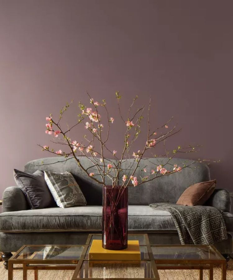
While undeniably elegant, Cinnamon Slate's deep hue might best be suited for accent walls, trim, or cabinetry. A whole room painted in this shade could create a dramatic, almost theatrical atmosphere, perfect for a home theater or a music room.
Glidden: Purple Basil
Glidden seems to be in lockstep with Benjamin Moore, choosing Purple Basil as their Color of the Year. This deep, moody purple, with its undertones of brown, further solidifies the trend towards richer, more complex hues.
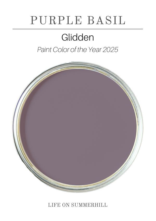
Similar to Cinnamon Slate, Purple Basil is best used on accent walls, furniture, cabinets, walls, adding depth and mood to a room without overwhelming it. It is great for theatre room where you want things dark for movie watching.
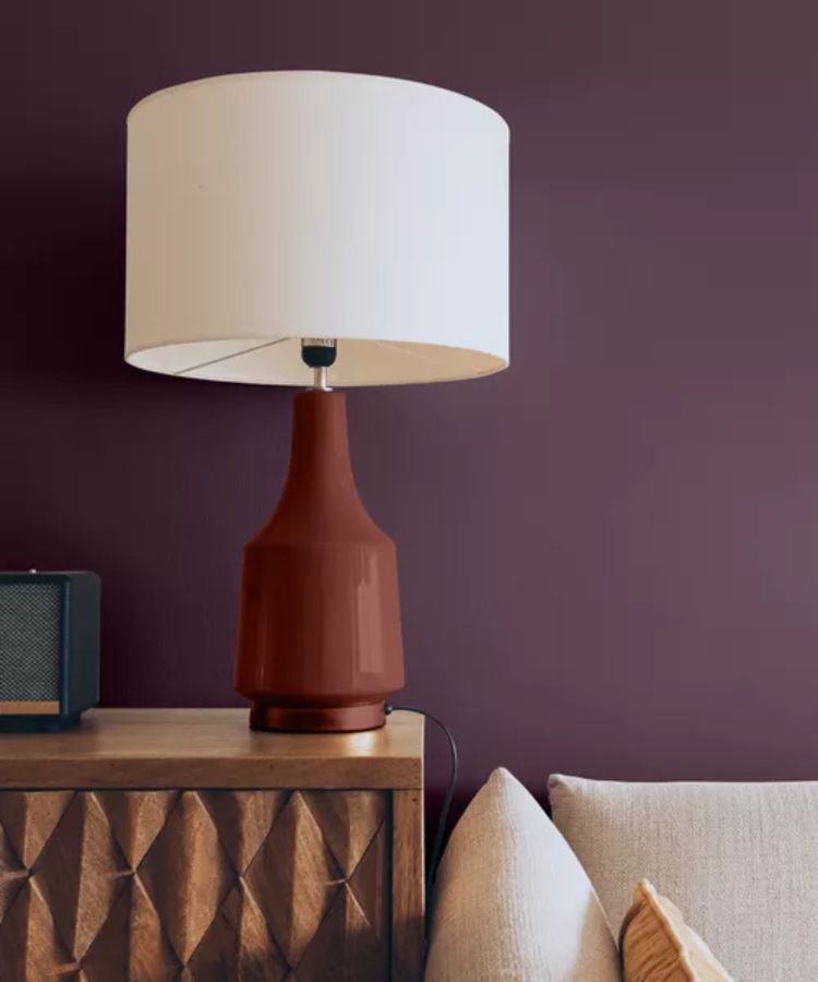
Any idea why many of the brands pulled purple from their yearly selections? Share your thoughts in the comments. Isn't it interesting to see the paint color of the year 2025. Let's keep going.
Behr: Rumors
Behr, a brand by Home Depot, has opted for Rumors, a deep burgundy red. Is it me or do I see purple undertones? With purple on my mind I am wondering if all I see if purple now.
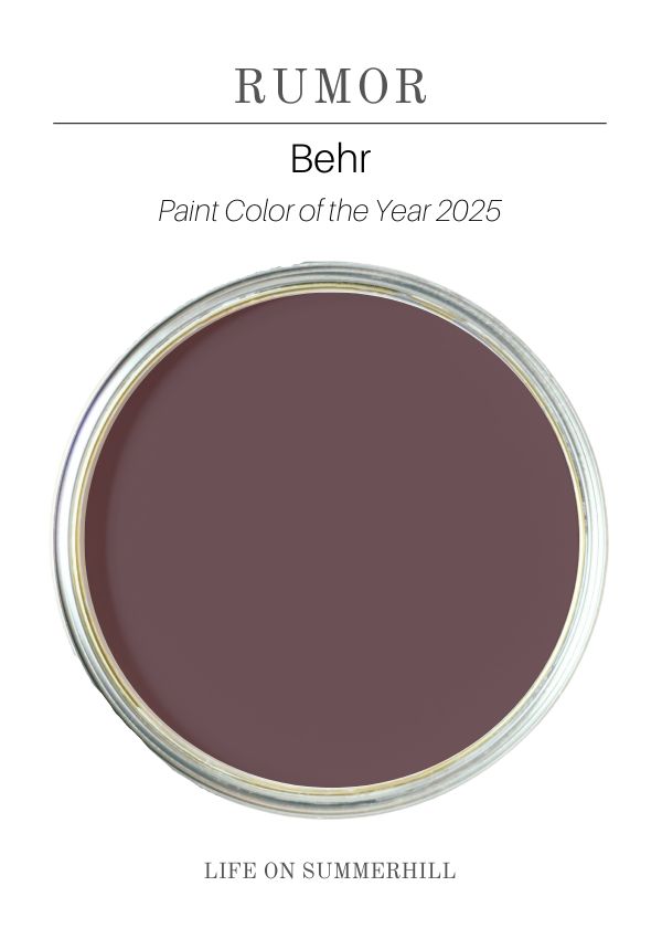
This choice aligns with the recent resurgence of jewel tones, adding a touch of dimension, drama, and sophistication to any space. This color brings to mind the elusive luxury of old world design. Whether used as a dramatic backdrop on an accent wall, walls, furniture cabinets, or even trim, Rumors is sure to make a statement.
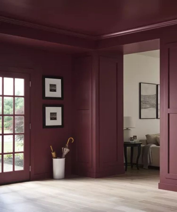
If you love moody and rich tones then this is a color to try.
HGTV Sherwin-Williams – Quietude
A breath of fresh air amidst the darker hues! HGTV Sherwin-Williams, sold at Lowes, has selected Quietude, a bright and cheerful green, as their Paint Color of the Year 2025. Can you believe it is not purple? LOL!
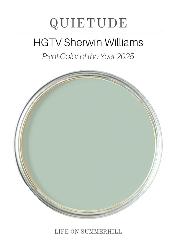
Let's backpedal for a moment. This is a great example of a brand choosing something very different from the others but I love it! Let's look at Quietude.
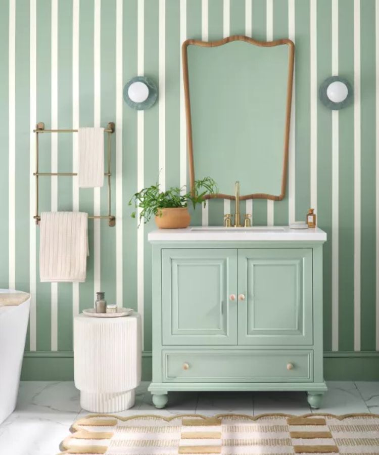
This uplifting shade is perfect for spaces lacking natural light and can infuse any room with a sense of joy and optimism. If there was a time we needed joy and optimisim it is now so good choice HGTV!
Where would I use this colors? A front door, walls, cabinets, furniture – pretty much anywhere especially beachy vibes. It is a vibrant color so before you buy paint for a whole room get a sample can and paint a large area to proof.
Pantone
Before we explore the selections of smaller brands, let's consider Pantone, the global authority on color. Their Color of the Year, Mocha Mousse, is a rich and inviting brown with subtle purple undertones.
Maybe this is where many of the paint brands got the idea of purple.

This choice perfectly encapsulates the mood of the year – a desire for warmth, coziness, and a touch of drama. This nuanced color is versatile and timeless.
Can you see where some of these brands got there inspriation? Pantone is a great place to start when looking at what is trending.
Hammered Black by Krylon
Krylon's 2025 Color of the Year is Hammered Black, a unique and unexpected choice.
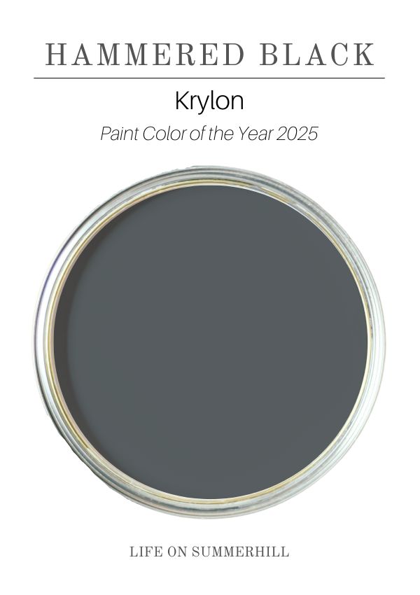
This textured black finish adds a touch of drama and sophistication to any project, from upcycled furniture to decorative accents. This color would look great on shutters as well.
It brings a modern sensibility and edge to classic DIY techniques.
Carmelized by Dunn-Edwards
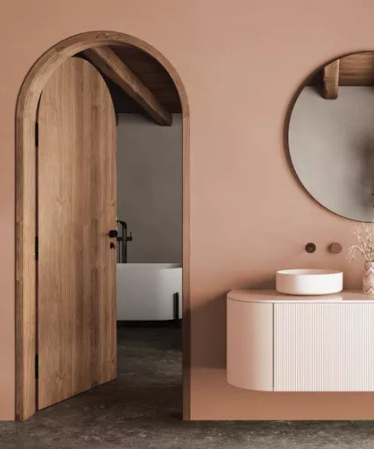
Carmelized by Dunn Edward, is a warm terracotta brown with soft, earthy tones. Think sunbaked clay or caramelized sugar for a toasty color of the year.
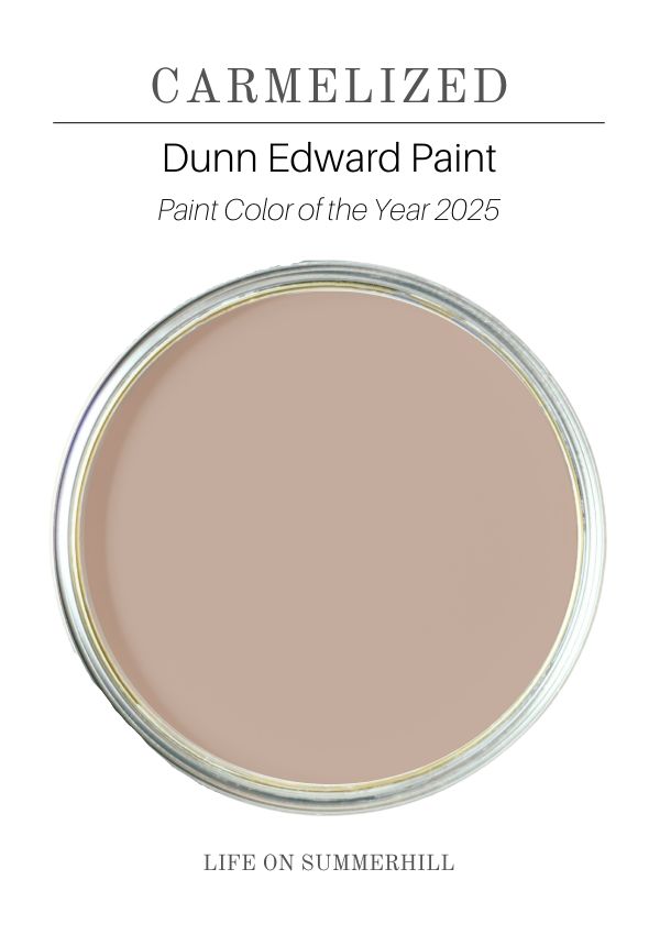
This sophisticated shade is incredibly versatile, working beautifully in both vintage-inspired and modern spaces. It's a perfect choice for creating a cozy and inviting atmosphere in your home. Ideal for creating a sense of comfort to any room.
Mapped Blue by Dutch Boy
If you love blue then you will fall in love with Mapped Blue by Dutch Boy. This blue is soft and pleasant but yet still gives you that color drenching effect.
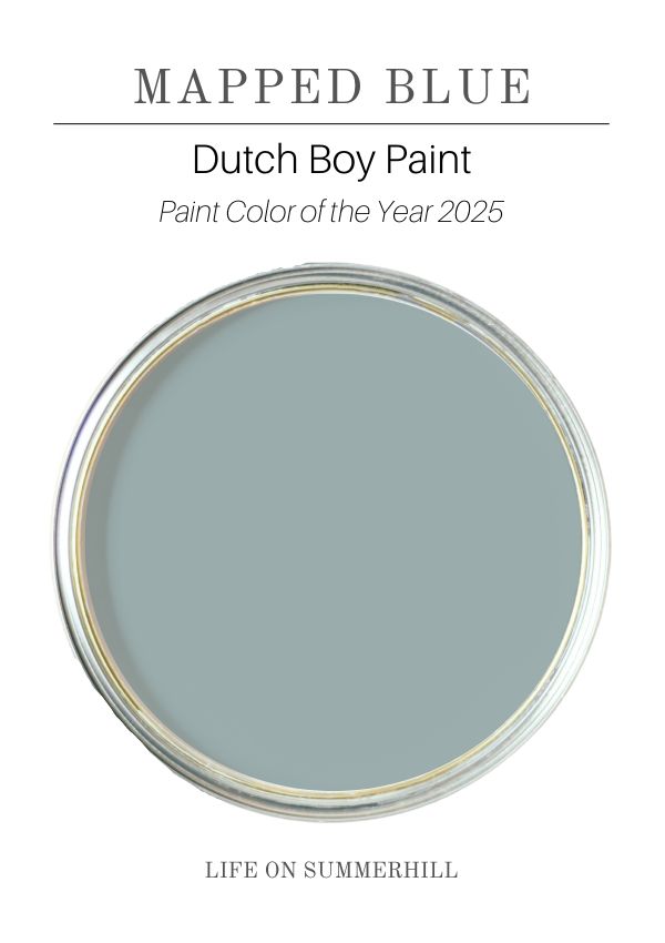
I do not have a photo to share of it in use but I have something even better for you.
To see a real example of someone using this color in their home check out Sara at Sincerely Sara. She used it in her mudroom/garage entry to liven up the space and it doesn't disappoint.
Where would I use this rich blue color that has yellow undertones? Before I answer this questions let me ask you if you can live with lots of color? If the answer is yes then go ahead and paint it on the wall, cabinets, floors or anywhere.
If you are unsure go for small pieces such as a door, furniture, wainscot or even small decorations such as a basket or wooden crate.
Encore by Valspar
Last is Encore by Valspar, sold at Lowes, which is another rich blue color that will give any room lots of mood.
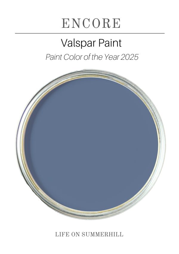
This blue is strong and if you love atmospheric deep blue tones, then it is right up your alley. Consider using it on accent walls, doors, and furniture, but remember, if you know you can live with lots of color, then go all the way and paint your walls.
Final Thoughts
The 2025 paint color forecasts reveal a fascinating array of muted colors.
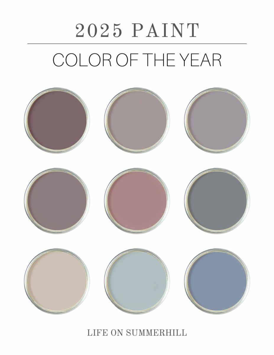
On one hand, there's a clear inclination towards deeper, more dramatic hues like Cinnamon Slate, Purple Basil, and Rumors. These colors evoke a sense of coziness and sophistication, inviting us to create intimate and enveloping spaces.
On the other hand, we see a counterpoint in brighter shades like Quietude and Chartreuse, offering a sense of optimism and a much-needed dose of happiness. They offer a great opportunity to add pops of complementary colors to your home.
And can we talk about many colors that are either timeless or comebacks from yesteryear such as Mauve Finery. Remember when Mauve and Teal were popular?
Ultimately, the most successful color choices will reflect your personal style and the unique character of your home.
Experiment with different shades and combinations by purchasing large samples from Samplize or check each brand for samples for purchase, and don't be afraid to embrace the unexpected.
Looking for more trending paint inspiration? Check out the paint color of the year in years past.
Happy Painting!
