

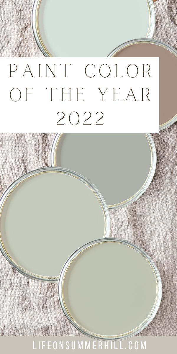
Every year paint companies and color experts pick out a paint color of the year. 2021 was nurturing nature inspired colours but the color of the year 2022 is all out green. See what colors I think will be trending and be inspired to add some to your home.
New year, new color! The new year is a great time for new beginnings. One of my favorite things to do each year is searching for the color of the year selections. It is a great way to see where our hues are taking us. The color of the year 2022 is very similar for each company.
Most of the time the colors are spot-on, at least from my perspective, but then there are colors that I think to myself where did that come from. Let me know what you think of this year's color trends.
Paint Color of the Year 2022
This year I can easily see myself recommending some of the colors, and there are other colors that I have been trying to figure out a way to blend into our modern farmhouse decor style. Let's go on a journey and look at each company's 2022 paint colors.
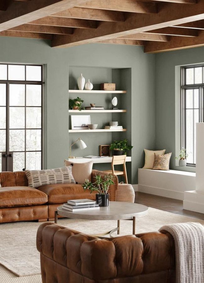
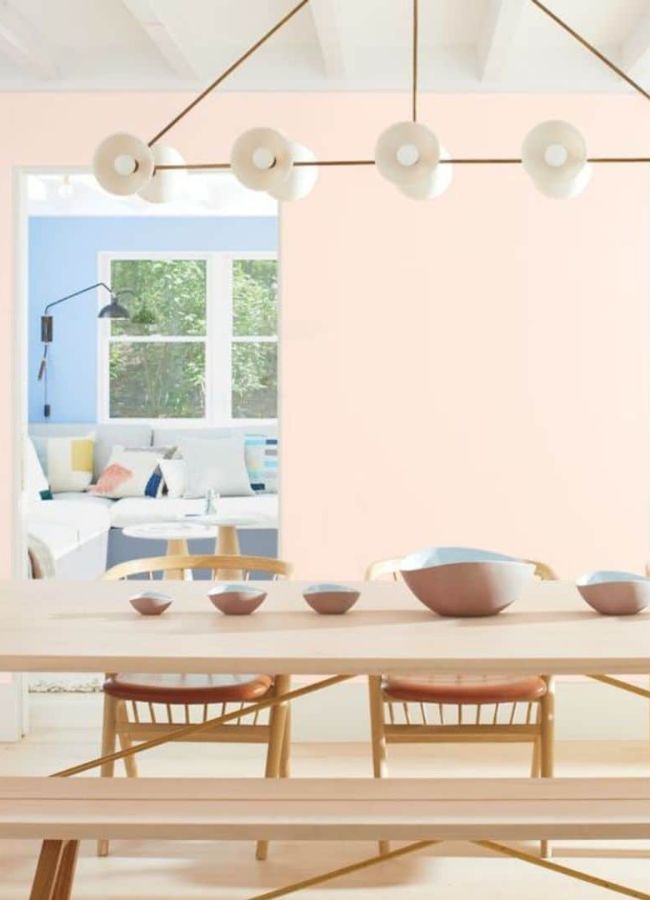
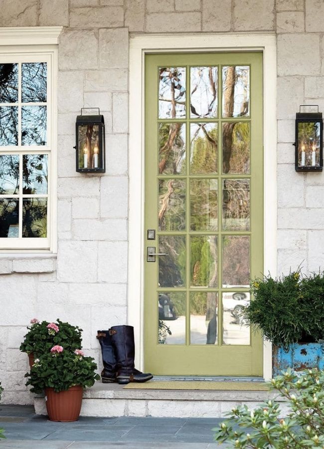
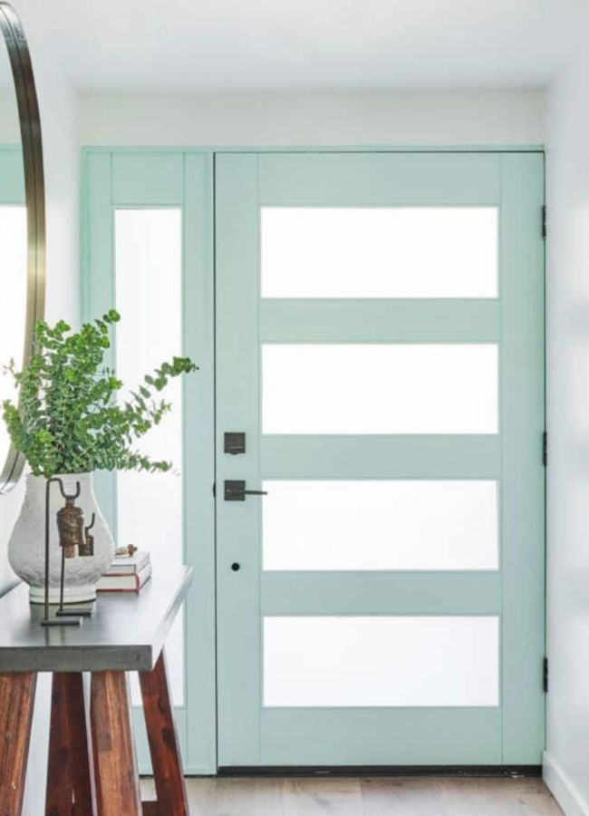
Sherwin Williams Evergreen Fog SW 9130
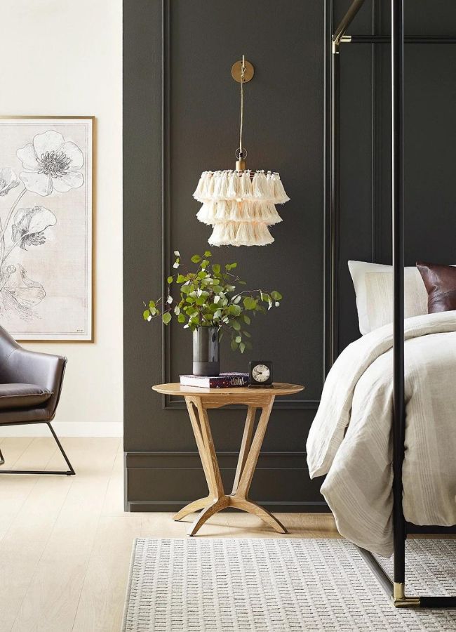
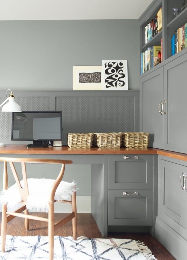
Sherwin Williams is opening the door in 2022 with another earth tone color. 2021 was a deep dark color called Urban Bronze SW 7048. This year it is a gorgeous shade of green called Evergreen Fog SW 9130.
This color can be used anywhere in your home. It would look great on a front door, walls, and furniture.
Now compare last year's color Urban Bronze. Look at how beautiful this color looks on an accent wall. It works with almost every design style.
For two years now Sherwin Williams is seeing a forecast of earth tones. The trendy colors they are recommending are winners in my book.
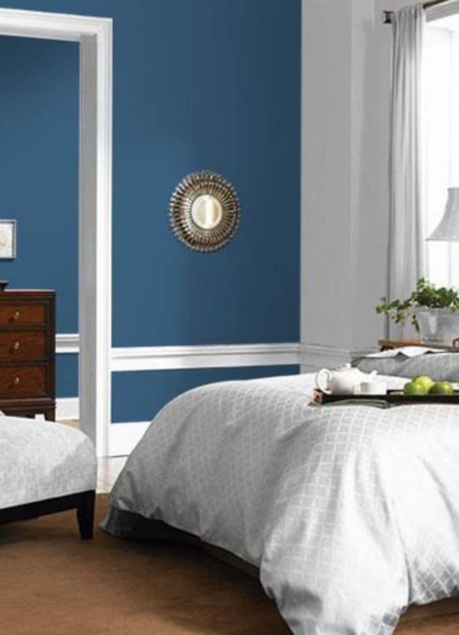
I have been writing about these colors of the year for four years now and I love how you can see the transition from one year to the other. I find it interesting that Sherwin Williams went from Naval SW 6244 in 2020 to these earth tone colors.
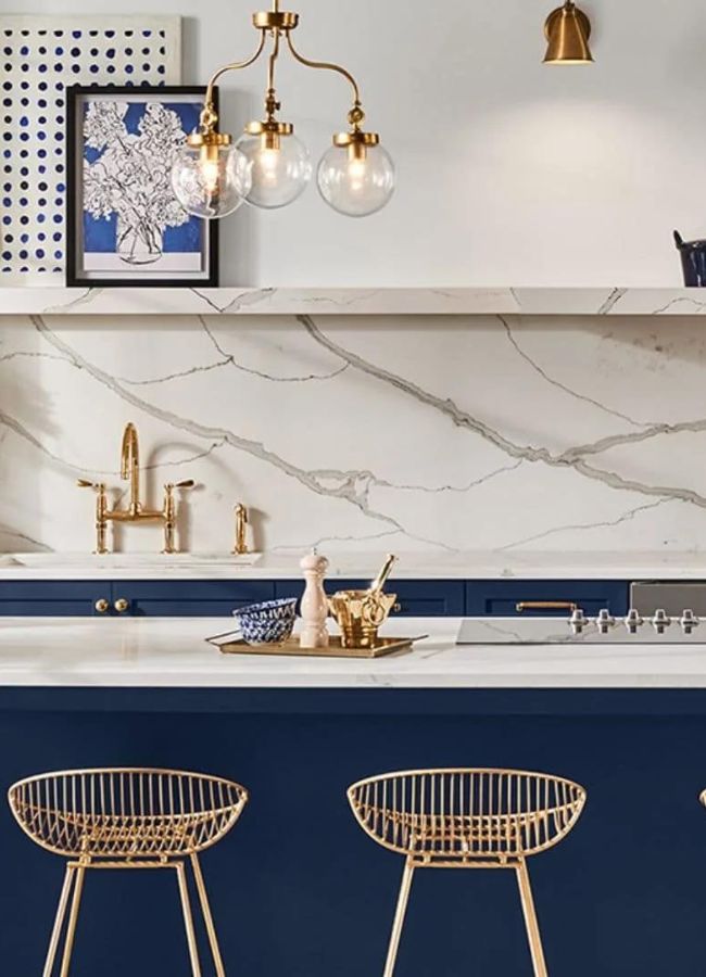
Naval is said to be a rich navy that creates a calm and grounding environment. A tone that will warm up any room.
If you love the color, this is an excellent choice for your walls, door, cabinetry, and so on. But if you are more of a neutral person, then I would recommend using it as an accent.
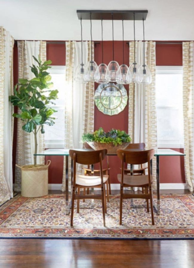
Cavern Clay SW 7701 was Sherwin William's color of the year for 2019. A color that would warm up any room. I love this color for a home office or dining room.

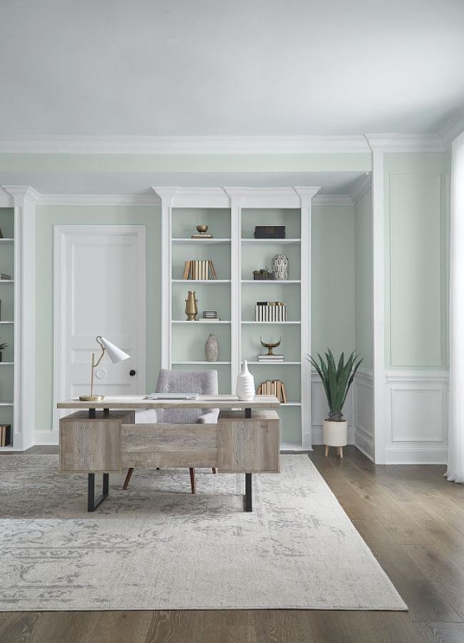
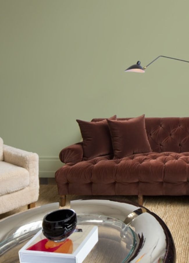
Benjamin Moore October Mist 1495
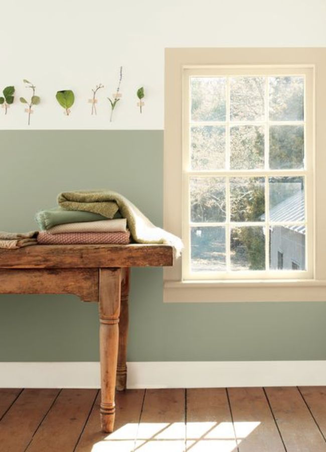
Last year I was so excited about Benjamin Moore's color but this year they made a great choice again with October Mist 1495. Look at this color's soft and relaxing hues. It is a great color.
This color will look great in a laundry room, accent wall, bedroom, or front door to name a few. This soothing green will be a family favorite. Now let's look back over the years to see Benjamin Moore's colors.
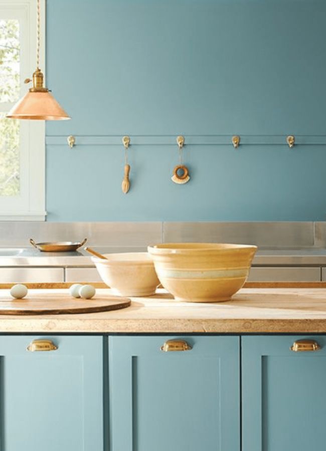
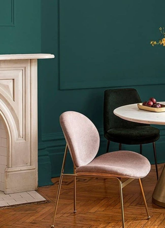
Here is Benjamin Moore's 2021 color of the year. Aegean Teal is so pretty! Just like Sherwin Williams, I think Benjamin Moore has knocked it out of the park.
Aegean Teal 2136-40 is a medium tone blue green color that will look amazing in many places. This is a fabulous color for a front door, cabinetry, furniture, and walls, especially accent walls.
First Light 2102-70 is Benjamin Moore's color of the year for 2020.
This is the perfect color to remind you of a gorgeous sunrise or sunset. Who wouldn't love to bring that indoors?
First Light is perfect on walls, doors, furniture, and accessories.
Benjamin Moore AC 690 Metropolitan, their color of 2019, is still a color that is trending right now. It is a great color for accent walls and cabinets. It pairs great with natural materials.
Behr Breezeway
Behr releases another green color but this one has bright and cheery written all over it. Meet Breezeway a lovely paint color that I think will love lovely in a coastal home.
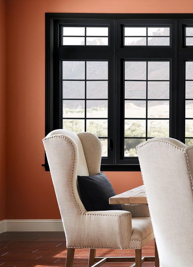
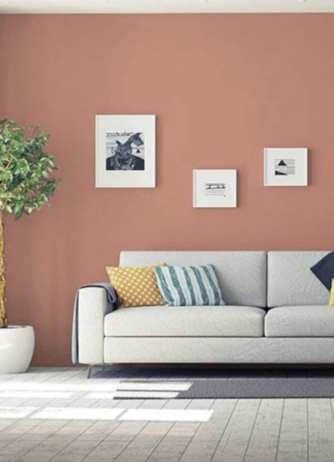
Behr 2021 color of the year was Canyon Dusk S210-4. This gentle-toned color is such a beautiful color! Warm neutrals have a calming effect. Doesn't it just look amazing in this bathroom?
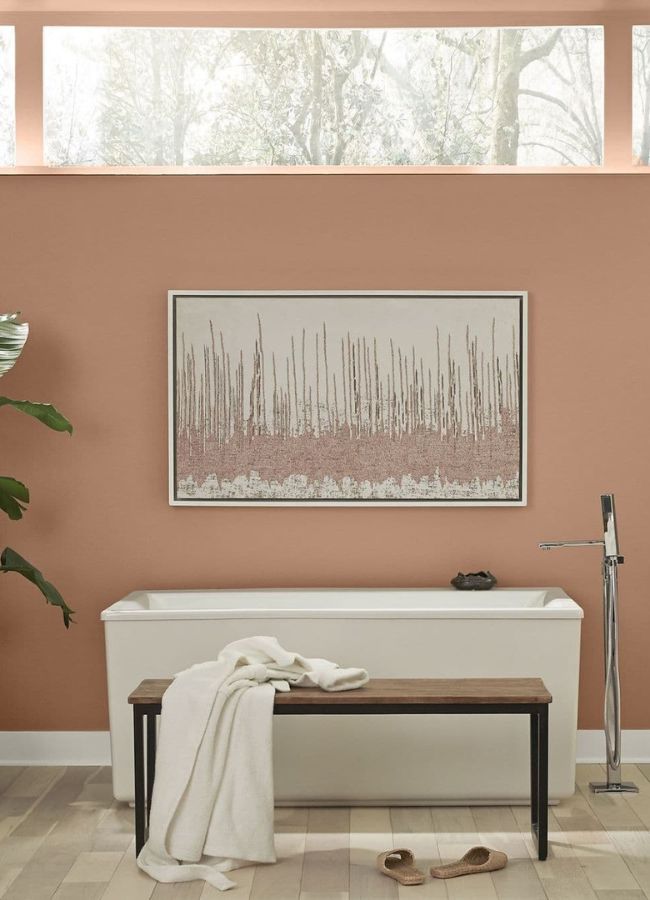
This lovely earthy terracotta color can be used for just about anything. Office, kitchen, bathroom, you name it! A warm hue that's incredibly versatile. Behr hit it spot on for a perfect summer color!
In 2020 Behr used an earth tone color called Back to Nature S340-4.
Back to Nature is a color that does just that and is a beautiful color for outdoors, but would look amazing inside your home too.
This is a color that would look great in your office, on your cabinets, in your living room, or bedroom but we love it on this door!
It's a subtle color that doesn't steal the show, but would be a great accent color. If you love green colors and would like more ideas try these popular Sherwin Williams green paint colors. Now let's look at Behr paints color from 2019.
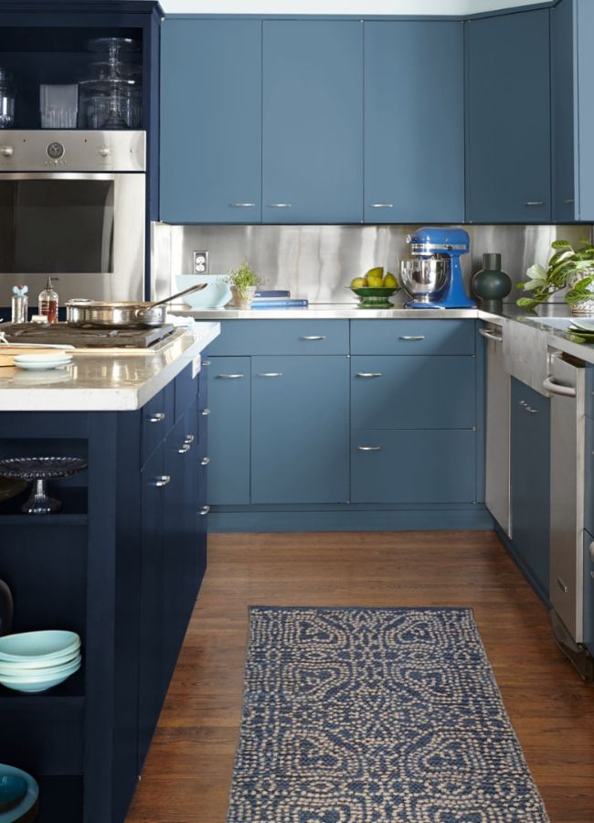
Blueprint S470-5 is a warm denim mid-range hue and was Behr's color of the year for 2019. The perfect accent wall color or cabinetry.
PPG Olive Sprig
PPG 2022 color of the year is Olive Sprig. Another wonderful nature inspired color. This color is great for walls, furniture, and doors.
PPG has released a color palette for 2021 instead of just one color. It was a beautiful reflection of the natural world. Big Cypress PPG1062-5 (pictured below), Transcend PPG1079-4, and Misty Aqua PPG1147-3.
The color Transcend PPG1079-4 is a midtone, shaded, brown sugar beige with a gingerbread undertone. It is perfect if you want to add warmth to a room.
Misty Aqua PPG1147-3 is a soft, muted, tropical turquoise aqua with an aquamarine undertone. It pairs perfectly with light creams and soft neutral accents. Do you like the idea of releasing color palettes or do you prefer one color per year?
The color of the year for 2020 is Chinese Porcelain PPG1160-6.
Blue is a timeless color and PPG has nailed it with Chinese Porcelain.
The blue with violet undertones is a serine color that takes you outdoors.
If your entryway is asking for a makeover, Chinese Porcelain is a great color to start with. It's inviting to any guests that might cross the threshold of your home and adds a sophisticated wash of color.
PPG paint color of the year in 2019 was Nightwatch PPG1145-7. This stunning statement shade provides a wonderful contrast when your decor is primarily neutral colors.
Dunn-Edwards Arts and Craft DET682
Dunn Edwards released their 2022 color of the year and it is right in there with all the other nature-inspired colors except this one is not green. Welcome this gorgeous brown tone called Arts and Craft DET682. This versatile shade brings warmth to your home and will complement most interior design trends.
This color reminds me of Sherwin William's 2021 color of the year. The moody warm tone will look amazing as an accent wall, all walls in a room, trim, and doors.
Their 2021 color of the year is Wild Blue Yonder DE5855. It brings the bright skies indoors. This light and airy pale blue is gorgeous!
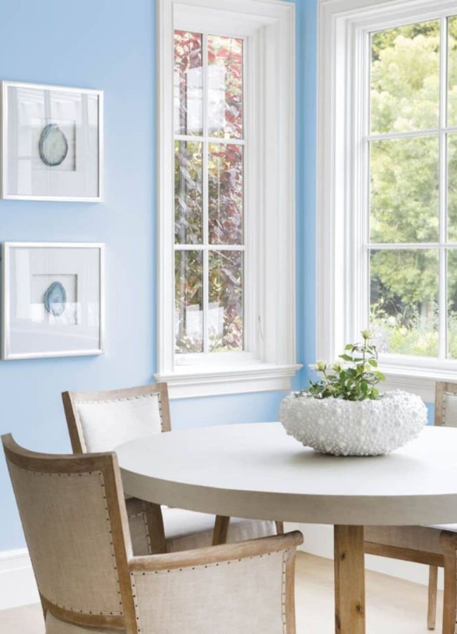
This blue hue pairs well with almost any type of décor style. Open up any room in your home with this color!
Minty Fresh DE5687 is their 2020 color of the year from Dunn-Edwards.
What a clean color this is. If you're tired of white, but don't want a bold color in your home, then Fresh Mint is a beautiful option.
This is a perfect color to lighten a room that doesn't have any natural light coming in.
There are so many options of where you could incorporate this color in your home. Anywhere from your kitchen walls, to your bathroom, to your outdoor patio. This green tone brings the sunshine indoors.
Fresh mint is a breath of fresh air for your home.
Dunn-Edwards color of the year from 2019 was Spice of Life DET439. This warm color pairs great with neutral decor.
Conclusion
Colors of the year are a great way to get new design ideas. Overall, I think all the paint companies and experts have given us great color options. Mostly leaning to natural greens, there are various ways to give your home a new look. Maybe it's time to change up your home's color scheme? The current trends contain wonderful choices from neutrals colors to bright colors that will reflect your personal style.
What is your favorite color and where would you use it?
I am toying with the thought of painting a door which is what I did several years ago when I painted my front door Benjamin Moore Wythe Blue. Changing your front door's color can give your home a new look in not much time.
I fell in love with that color then so you never know if you will fall in love with one of these colors now.
What color choices do you predict will be popular next year?
You can see how things progressed by checking out these posts:
Happy Decorating!

I wish I still had a Coasthouse. I would certainly use “living coral” somewhere. #hurricanemichael
It would have been a great color for the coast house!
I have used a colour similar to the blue print on the walls of our guest room. However it was my own mixing of leftover paints. I love doing that to create colours that I love. Blues, most greens, coral and aquas. I’m looking forward to testing and using some of these colours.
I love blues and greens! Good luck with trying the colors of the year in your home.